Take some clueless bureaucrats, a very large pile of taxpayers’ money and a handful of trendy 50-something guys with receding ponytails, and what do you get? With an embarrassing lack of embarrassment, the Hong Kong government unveils its latest BrandHK logo.
 The Big Lychee’s first logo, introduced in the 1840s, served the city reasonably well for a century and a half. It was painstakingly designed by bohemian Victorians sporting green-rimmed monocles and inspired by laudanum. The brand strategy and positioning was ‘East meets West and does what it’s told’ – represented by the dragon and a lion, plus a little extra lion on top in case you didn’t get the whole message. Fee: 72 guineas.
 Hong Kong’s long-awaited re-branding in the late 20th Century dispatched with the outdated colonial look to fully reflect its emergence as a dynamic, modern, multi-dimensional and always changing hub. (The lengthy list of adjectives associated with the city-turned-product took up entire double-decker buses at one time. The most memorable, perhaps, was the word ‘progressive’, which was in some ways fitting for one of the few places in Asia with no death penalty, no jailing of dissidents or gays, no censorship, etc, but nonetheless seemed a bit jarring. It was possibly intended to irritate Singapore.) Fee: HK$52 million, which was justified by the very nifty adaptation of the characters heung and kong into a dragon’s head – plus, at no extra charge, the letters H and K if you look really carefully.
This design has now been overhauled following an extensive course of public engagement, opinion surveys, consultation with opinion leaders and discussion groups. According to the guys in pony tails: “The dragon image and the brandline [that’s the slogan] have built up equity over the years. Both are now well recognised in connection with Hong Kong while the city is, if anything, [this is where the civil servants decide to accept the pitch and the price] even more ‘Asia’s world city’ than it was at the start of the millennium.”
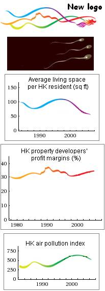
 The relaunched logo now incorporates what are, we are told, coloured ribbons. Anyone looking at it and immediately imagining male gametes wriggling their way up a fallopian tube in search of an ovum is sick and probably needs some sort of treatment, possibly including beatings with large volumes of Rorschach ink-blot tests.
Chief Secretary John Tsang, introducing the vivid new look, explains that the blue and green ribbons extending from the dragon symbolize “blue sky and a sustainable environment.” The wrinkle in the red ribbon, which represents pigs flying to a land where it’s Christmas every day, is the outline of Lion Rock. (Admit it – you had to be told.) My own quick look through the latest Annual Digest of Statistics suggests that these curvy psychedelic trails could have more down-to-earth meanings.
There are now 10 official adjectives or buzz words to reflect core values, Tsang says. Acutely aware of the tendency for negative-thinking cynics to mock, he stresses that two phrases, namely ‘innovative’ and ‘quality living’, “have been classified as ‘aspirational’ values.” I’d have done the same, I must say. Thank God for ad-men – how else would we get core values?
Fee: HK$69.9 billion, mostly owing to the Lion Rock allusion.

No double our brilliant civil servants are capable of finding innovative ways of squandering the taxpayers’ hard earned dollars.
I can hardly find this so-called logo used anywhere else other than on the lapels of our senior male officials and in front of the radiator grilles of “AM” licenced vehicles.
I wish they’d asked me. I would have just put a SARS mask on their loathsome little “dog on fire” mascot.
Bigot is wrong – Cathay have it on their planes as well. Th problem is, the logo only exists as a left-facing one, therefore, the port-side of the plane shows a totally regressive image of a dragon flying backwards, which is clearly not compatible with our forward-looking image; but to produce a reight-handed version as well would have cost us taxpayers twice as much. Or maybe they just didn’t think of it….
1. Being a clapped-out expat, you do not earn what young advertising people do. No shame in admitting that.
2. You want to be in the old Colonial days instead of being a freelancer for MI6. Shame in that.
actually it reminds me of the voodoo ribbons that one can buy in Brazil for a small extra fee at most Catholic churches … I told you this place is in grips of the church.
Now will you believe me?
http://travelogue.travelvice.com/brazil/salvador-bonfim-wish-ribbons/
They’re called lembrancas
So now the creative types at G.O.D can sell ribbons matching the logo with wishes from the community wrt sperm, pollution and housing prices … it’s win win all round!
I had to check my figures several times while doing the conversion. I have tried to find references to cross check. I can’t believe even bureaucrats would spend HK 69.9 BILLION on a branding campaign. Thats enough to buy buy a small country. Could someone please post verifiable links to that figure? Or is this just some kind of early April fools joke?