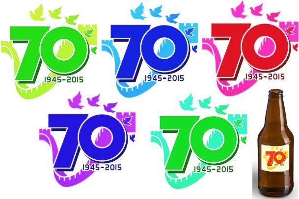
China unveils the logo for the commemoration of the 70th anniversary of the Victory of the Chinese People’s War of Resistance Against Japanese Aggression and the World Anti-Fascist War. Obviously, a large committee wrangled over it for weeks…

…leaving us with some mightily over-wrought symbolism. The Xinhua report says that the V-shaped Great Wall represents not only the victory but the unity of the Chinese nation. A wall is an unusual symbol of unity, and it sounds like a last-minute addition to the list of underlying messages that had to be crammed into the design. The doves bear an even greater burden in this respect:
The five pigeons demonstrate the memory of history and the aspiration for peace, representing people from the five continents united and moving together towards a beautiful future after going through “bloods [sic] and fire.”
But wait – the poor birds aren’t finished:
The doves also symbolize the Chinese people … flying to a future of great rejuvenation under the leadership of the Communist Party of China…
They could have said the bold red colour of the ‘70’ represents the rejuvenation Communist blah-blah – thus leaving the doves to signify only the nice cuddly brotherhood-of-man stuff – but maybe that was too goes-without-saying, and the Party wanted more.
The logo is busy in terms of symbolism because the anniversary itself has to convey multiple meanings. The event, including a military parade in Beijing, has to stress the Chinese victimhood thing, and the Communist Party-to-the-nation’s-rescue thing. But it also has to lay on a specifically anti-Japanese message, while paying lip-service to future international cooperation and peace. Given the Communist Party’s difficulties in calibrating finesse and good grace, Western countries will apparently downplay their presence at the celebrations.
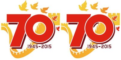
The Xinhua story says that the graphic may not be used for commercial purposes. It’s unlikely that anyone would want a Chinese-logo T-shirt without the usual friendly smiling panda bear. And the red-and-yellow colour scheme is a turnoff, with the Leninist, Maoist and other sinister connotations. As the alternatives below show, even with its plodding grim symbolism, the design could have been jazzed up for extra ‘soft power’ and all-round coolness. That said, perhaps with Hong Kong’s forthcoming September 3 Victory over Japan public holiday in mind, it would make a good label for a beer bottle…
A nagging thought… Is there a piece of shadow missing from the inside of the zero in the ‘70’ (as corrected on the right)?
These things irritate me.
The lack of a shadow on the “0” is in keeping with windows-with-Chinese-characteristics…
http://www.businessinsider.com.au/fake-windows-on-chinese-building-go-viral-2013-10
V for Victory?
Is this the logo for the English speaking world?
I suppose that CPWRAJA, for Chinese People’s War of Resistance Against Japanese Aggression didn’t really fit on the logo.
Maybe it’s just me, but when I squint that wall seems to resemble the lower jaw of a skull.
Unless the bit inside the circle isn’t the wall, and is yet another symbol, symbolising the cover-up of truth (the wall) with an image that may look like the real wall but he wall behind is actually broken and stuff.
Am I the only one seeing the strange irony here:
“The five pigeons demonstrate the memory of history and the aspiration for peace, …”
So to demonstrate their aspirations of peace they will have a massive military parade which in true Communist form will have giant missiles and thousands of robotic soldiers. Hopefully they will all be looking really peaceful while holding guns.
Slow news day, Hemmers?
Has something got lost in translation? I had the distinct impression that we were celebrating the (Sino-)Japanese WarS.
The shadow is deliberately missing from the 0, since it is connotes a very large cannon, just as the angle of the 7 echoes SS in runic script.
Bloods and fire: a reference to Nazi “Blut und…”, which of course contained a similar racism, aggrieved victimhood, revanchism and (not-so)veiled threat.
As someone else suggested, perhaps the 70 represents the number of deaths, in millions, the CCP is responsible for.
I thought the Sino-Japanese war started in 1932, was put on hold for a while and then kicked off big-time in 1937?
All in all… https://www.youtube.com/watch?v=HrxX9TBj2zY
The shadow, from a physics nerd pov, is completely off to begin with… let alone the o… more grist for the mill?
War crimes committed by the Japanese invading Manchuria in 1931, then China proper in 1937, had been so forgotten that when a Japanese delegation visited Fudan University in Shanghai where I was studying in 1974, the campus was festooned with banners that proclaimed, “Friendship between the Japanese and Chinese People, from Generation to Generation.”
Isabel Hilton Prospect (magazine) October 2011
Is the use of the term “Hemmers” a public school thingy?
Hemmers goes hand-in-hand with Honkers. It’s what one would expect from a public school, Jardine Johnnie type.
The CCP: We saved Stalingrad from Jerry, sank the Japanese Navy at Midway, Landed on Omaha Beach, Iwo Jima and took out the Luftwaffe single handedly.
@Chinese Netizen – and probably dropped nukes on Hiroshima and Nagasaki as well for good measure.